Have you ever tried to look at your phone in the sun only not to be able to read the screen? Or have you tried to read a road sign only you can’t tell if it’s a street or a lane? What about the dreaded moment when you stand on a piece of Lego you didn’t see coming even though it was right in front of you? Accessibility impacts us in everyday life. However, people living with disabilities are greatly impacted when things such as websites aren’t accessible. An accessible website ensures there are no barriers to information and services. Those in the public sector should have their websites and platforms in line with WCAG (Web Content Accessibility Guidelines). Following WCAG is also a best practice. If you are not quite there yet, there are small changes you can make to create a big impact.
In November 2023, Wainui Witika-Park, Rōpū kohinga developer at Catalyst IT presented ‘Small changes – big impact’ at NDF (National Digital Forum). She outlined three easy ways to improve web accessibility in Koha for people who use a screen reader including blind and low vision users. We’ll be sharing her insights in the blog below.
This blog post focuses on practical steps to improve accessibility in the Koha Library Management System. However, the principles are translatable across other platforms and web content.
Think about how people with visual disabilities consume content
Firstly, consider how people with blindness or low vision consume web content. Now, think about the core reasons people visit websites. Generally, it’s to browse, navigate, and read in detail any stand-out content. Phones and computers have inbuilt features that allow information to be read aloud instead of being physically read. However, when the structure of page information isn’t considered, it doesn’t make sense when it’s read aloud by screen readers. Understandably for screen reader users, it’s frustrating listening to a whole section only to find out it’s irrelevant. Additionally, if there are no context clues for skimming content, it slows down the process of finding the information they’re after.
3 easy ways to improve accessibility in Koha
These are small changes you can make a big impact on your Koha website visitors.
1. Page titles

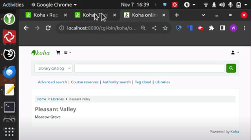
Above is a page from the demo version of the Koha OPAC - it hasn’t had accessibility improvements made to the page titles yet. The tabs only show the start of the word on the page title since the screen is zoomed in. So when you have multiple tabs open, you can’t easily identify which tab belongs to which page.
If your visitors are using a screen reader, when they switch between tabs, the screen reader will read out each page title. But, when it gets to each tab, it has to read ‘Koha’ each time before it gets to the unique page title name. This can be frustrating for screen readers users who want to quickly tab through the first word of each page to identify what’s on each page.

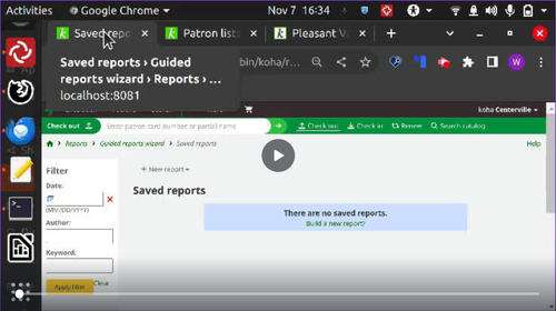
With a few quick accessibility changes to the same example, the tabs display with differentiated titles clearly, even when the screen is zoomed in. Now, it is easier to know which page is which. Equally, that means for screen readers users, the unique information is read first. Now, they can quickly tab through and know which page they’re on.
2. Headings
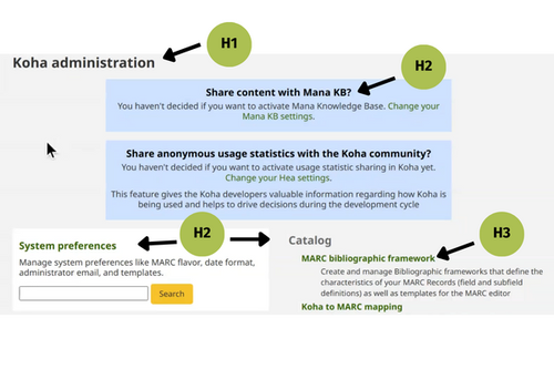
Headings are the words or sentences on a web page acting as a headline or title to break up web page content. Additionally, they provide page content structure by organising it into smaller, easier-to-navigate sections. For example, an H1 (level one heading) is the highest heading level, and there should only be one H1 on each web page. So, normally a level one heading is used for the page’s title. Then, the rest of the headings should follow a logical hierarchy so it’s easy to understand the context of information on a web page and navigate easily.
Did you know you can also hide the heading level one with a screen reader-only class? Then, the heading will be accessible for screen readers but have no visual change on the screen.

A common trap for accessibility is when heading levels are not used in a hierarchy due to wanting a particular size or font for a section. But you can change sizing and visual elements through styling instead of rearranging the hierarchy.
3. Form and table elements
Forms and tables are common components found on a website. They both have special headings that help us understand what information they’re presenting. Here are a few easy ways to improve web accessibility in Koha forms and tables.
Tables
A caption for a table is like a heading. A table without a caption provides no context, especially for a screen reader. A screen reader will jump to the first row of a table, which is jarring without a title. Captions are easy to add to the HTML and there's the option to not display them visually.
Forms
Forms are similar to tables, but instead of a caption, you need to have a legend heading in forms to describe the content. You can easily set this up in HTML by adding the legend tag. Additionally, these can not be displayed visually and are still read by a screen reader.
Need support to improve your accessibility in Koha?
Our three easy ways to improve web accessibility in Koha are quick changes you can make in your HTML by updating page titles, headings, and form/table elements. These are a great starting point for a more accessible website, but there is more you can do to improve your user experience too. If you want to learn more about improving your accessibility in Koha, contact us today.