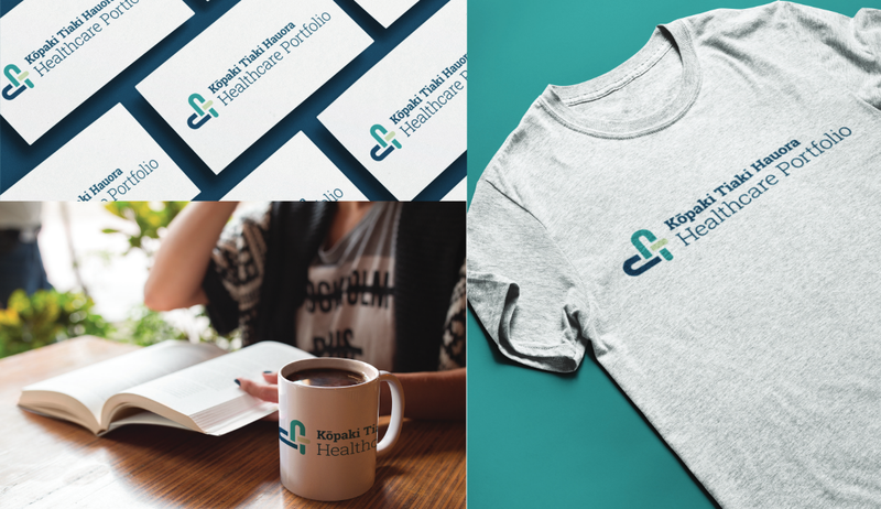
The Catalyst design team partnered with Kōpaki Tiaki Hauora Healthcare Portfolio to create a brand for their Mahara site. This project included creating the site logo, brand colours, and imagery.
The site's purpose is for healthcare professionals in New Zealand to create and maintain their professional portfolios.
Approaching the design
Evonne Cheung, who led the design work said, "Our goal was to achieve two things in this design: simplicity and clarity. The challenge lay in creating a simple design that is inclusive of a wide range of audiences within the healthcare sector."
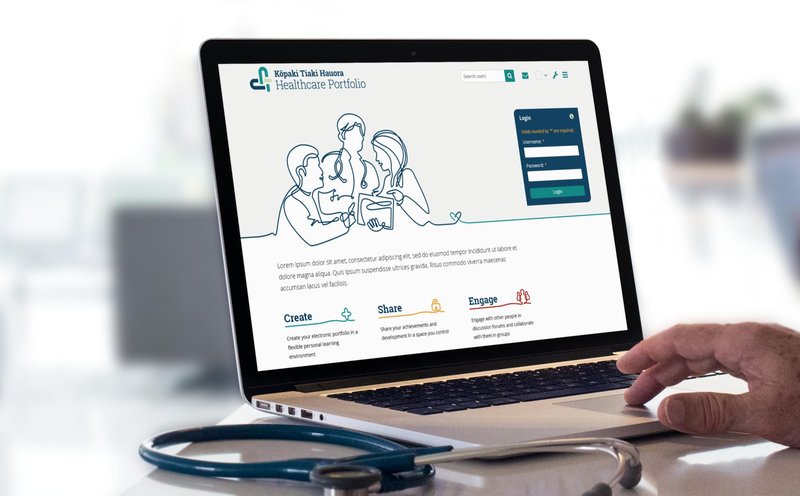
The design team wanted to reflect the human side of healthcare on the homepage. They found that photographic imagery wasn’t appropriate for achieving this. So, the result is a continuous line illustration representing all healthcare workers. This illustration encourages people to impose the age, ethnicity, religion, and gender that they relate to. The modern, simple style will also prevent the page from feeling prematurely aged.

Designing a logo
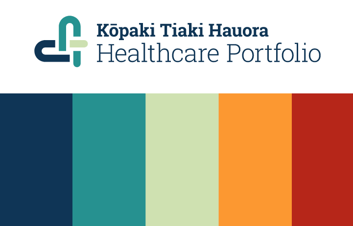
With Kiwi healthcare professionals of all ages, ethnicities, and genders using the portfolio site, it was essential to acknowledge Māori roots. At the same time, it remains accessible and welcoming to international healthcare workers. This balance is achieved through the site's primary title being in te reo Māori and the Māori practice of weaving inspired the logo. Additionally, the logo represents two important aspects of healthcare: warmth and compassion through its heart shape.

Building a colour scheme
The colour scheme reflects healthcare and New Zealand as a country:
- Blue and teal for the ocean that surrounds Aotearoa.
- Red as the heart.
- Yellow and light teal as the accent colours.
These consistent brand colours lead to easy recognition and facilitate the creation of additional materials in a consistent colour scheme.

The design and Mahara teams have successfully collaborated to create a brand that conveys healthcare, professionalism, knowledge, trust, and warmth.
Learn more about our UX and design services and Mahara.